Luis Schneider
I’m a graphic designer working across disciplines, with a focus on print and book design. I develop publications, visual identities and websites, often within cultural and editorial contexts. My work is concept-driven, exploring typography, visual systems and experimental approaches.
For portfolio requests, commissions or further information, feel free to get in touch via email or instagram
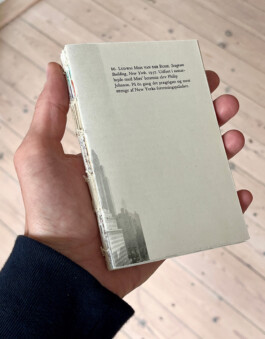

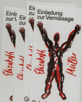

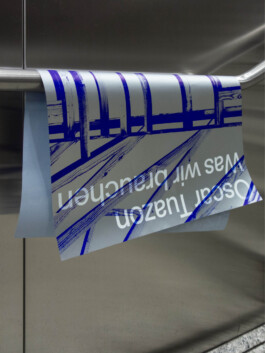
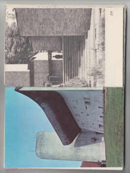
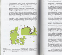
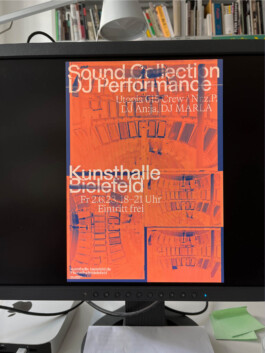
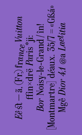
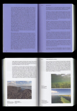
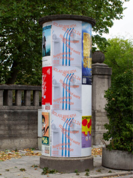
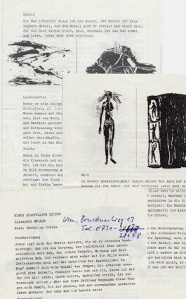
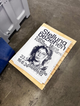
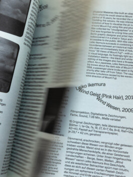
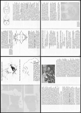
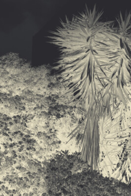
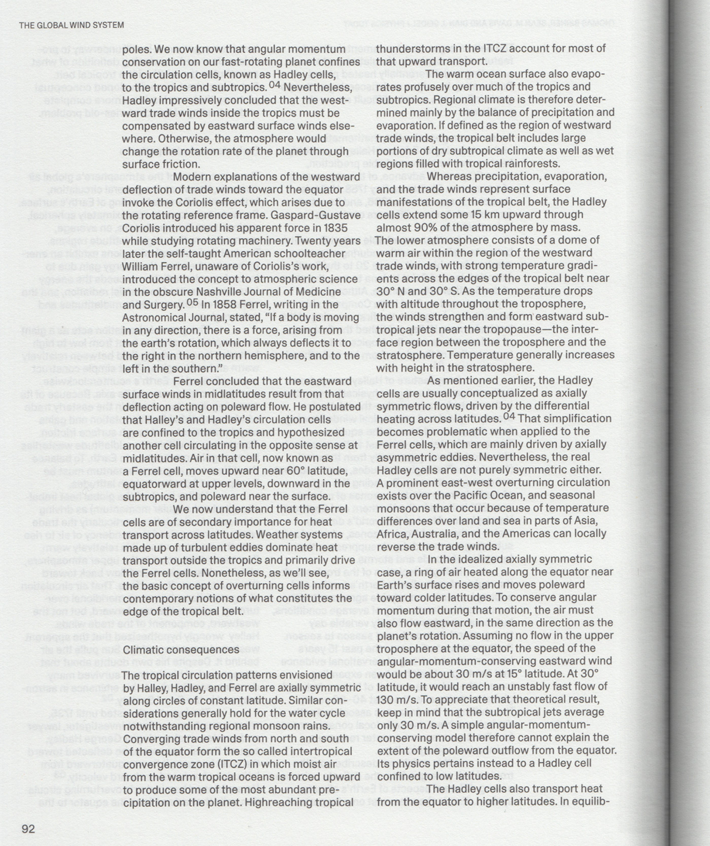
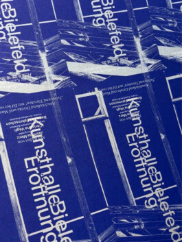
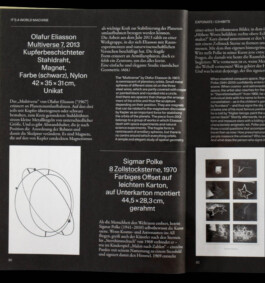
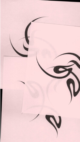
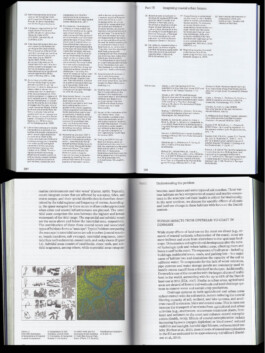
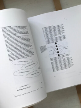
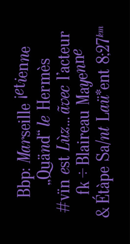
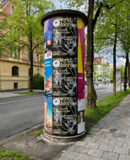
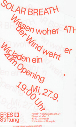
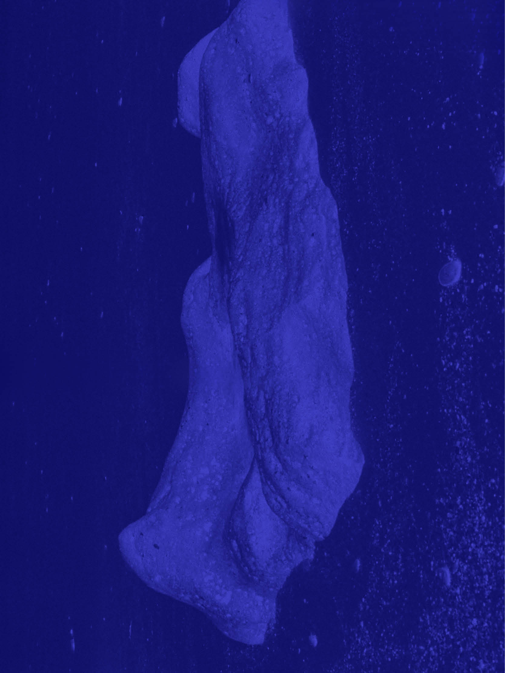
with/at strobo B M (Art Direction: Matthias Friederich, Julian von Klier)
with/at strobo B M (Art Direction: Matthias Friederich, Julian von Klier)
with/at strobo B M (Art Direction: Matthias Friederich, Julian von Klier)
with/at strobo B M (Art Direction: Matthias Friederich, Julian von Klier)
with/at strobo B M (Art Direction: Matthias Friederich, Julian von Klier)
with/at strobo B M (Art Direction: Matthias Friederich, Julian von Klier)
with/at strobo B M (Art Direction: Matthias Friederich, Julian von Klier)
with/at strobo B M (Art Direction: Matthias Friederich, Julian von Klier)
with/at strobo B M (Art Direction: Matthias Friederich, Julian von Klier)
with/at strobo B M (Art Direction: Matthias Friederich, Julian von Klier)
with/at strobo B M (Art Direction: Matthias Friederich, Julian von Klier)
with/at strobo B M (Art Direction: Matthias Friederich, Julian von Klier)
Luis Schneider
I’m a graphic designer working across disciplines, with a focus on print and book design. I develop publications, visual identities and websites, often within cultural and editorial contexts. My work is concept-driven, exploring typography, visual systems and experimental approaches.
For portfolio requests, commissions or further information, feel free to get in touch via email or instagram


with/at strobo B M (Art Direction: Matthias Friederich, Julian von Klier)
with/at strobo B M (Art Direction: Matthias Friederich, Julian von Klier)
with/at strobo B M (Art Direction: Matthias Friederich, Julian von Klier)
with/at strobo B M (Art Direction: Matthias Friederich, Julian von Klier)
with/at strobo B M (Art Direction: Matthias Friederich, Julian von Klier)
with/at strobo B M (Art Direction: Matthias Friederich, Julian von Klier)
with/at strobo B M (Art Direction: Matthias Friederich, Julian von Klier)
with/at strobo B M (Art Direction: Matthias Friederich, Julian von Klier)
with/at strobo B M (Art Direction: Matthias Friederich, Julian von Klier)
with/at strobo B M (Art Direction: Matthias Friederich, Julian von Klier)
with/at strobo B M (Art Direction: Matthias Friederich, Julian von Klier)
with/at strobo B M (Art Direction: Matthias Friederich, Julian von Klier)